
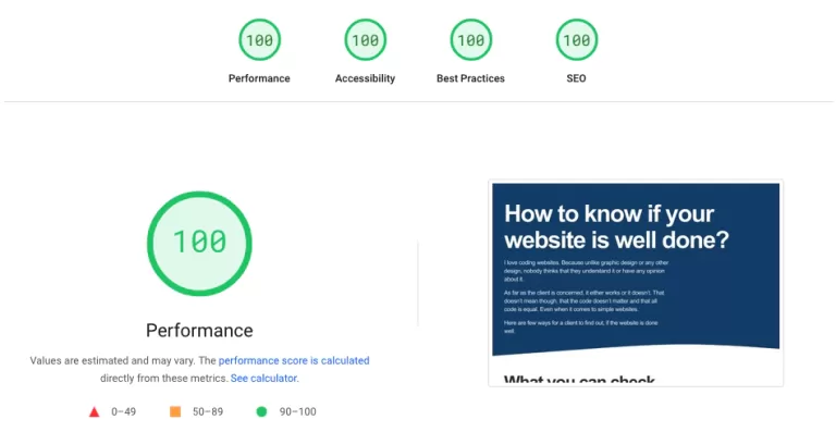
How to know if your website is well done?

I love coding websites. Because unlike graphic design or any other design, nobody thinks that they understand it or have any opinion about it.

As far as the client is concerned, it either works or it doesn’t. That doesn’t mean though, that the code doesn’t matter and that all code is equal. Even when it comes to simple websites.

Here are few ways for a client to find out, if the website is done well.

What you can check, without any technical knowledge:

Mobile Responsiveness

Thanks to mobile phones, there is now approximately one billion different screen sizes. That creates a rather difficult problem for a coder, because the websites suppose to work on all the devices.

>>> How to check

Speed

Even though the internet is getting faster and faster, not everybody has the superfast broadband, or they could be in a dungeon with a bad signal. And there is nothing more annoying than waiting for website to load.

>>> How to check

Accessibility

Thankfully, more and more attention is given to websites being accessible for the unfortunate people with different disabilities, which could be anything from problems with eyesight, mobility, hearing and more.

>>> How to check

Content Management

It’s now a common practice, that the client is given some sort of  system, called the Content Management System (CMS). This system should allow the client to change the content on the website without any coding knowledge.

>>> What to expect

No client has ever said to me:
“I don’t like this code”.

Mobile responsiveness

Back in the days and unfortunately still, websites were made for desktop screen sizes only. In a better scenario, they were made for mobile, tablet, and desktop. What that meant, is that at some point, the whole website got narrower to fit on the screen and more space was on the sides, until the website didn’t fit again, and it got narrower again.

How it should look like, though, is that the entire website always fits the screen! Meaning, all the fonts and the spaces between them should adjust, according to the size.

The easiest way to check, is simply to take your browser window and make it smaller and wider, and the result should be the same as with this website:

Do you see how the fonts change size?
Never too big, never too small, always fit.

Speed

I beg you on my knees, do not be mean to your developer, if you don’t get a 100. There are so many aspects involved in the speed, starting from the location to complexity of the website. 

Nevertheless, if your website scores really low, it should be taken care of, slow speeds will make your visitors go away.

You can easily check your website speed at
https://pagespeed.web.dev/
simply put your url there and see…

Performance of well done website scores 100

Accessibility

It is very important to think about all the people that don’t have the ability to use the computer as we normally do. They might not be able to see very well or, at all, be able to use the mouse or the keyboard. We have to make the websites for them too.

There are a couple of rules and ways for you to check, if your website is accessible.

Contrast and Readability

Sometimes designers love to use low contrast, I guess it looks cool. Unfortunately, that is a bad practise in general. It’s nice to be able to see and read the information you want to give.

Image description

All your images should have a description in them, telling people what is on the image, if they can’t see it. In technical terms, this is called Image Alt text.

Navigate with keyboard

Try to use the TAB key and see, if you are able to navigate and use the website the same way as you would with your mouse. If not, that is a problem.

CMS / WordPress

Unfortunately, I am only familiar with WordPress (WP), the most commonly used CMS in the world. The popularity of WordPress is great, but also it’s biggest problem. There is nothing easier than making a terrible website with WordPress.

It’s usually a bit too late to do something about this, if the website is already done, but at least, you can be sure, that your developer did a good job.

No Premium themes

The easiest way to make a cool-looking website on WP is to buy a premium theme. Basically, the website is done. The problem with this, is that the developer is buying a code, that they don’t know, and it’s also a one time payment. So, in the future, when WP gets updates, the theme will break and the best thing to do, is to make the website again from scratch.

If you are paying a developer, make sure, they do not use premium themes, the most common marketplace is called Themeforest.

Security

WordPress is so popular not only in the developer community, but also in the hacker’s community. You might think that nobody wants to hack you, and you are probably correct. The problem is, that your website can send e-mails, especially advertising different body parts enhancements.

So make sure, your website is secure.

Content builder

These are for the client to be able to nicely add more content with some drag-and-drop builder. So, giving the client some easy way to adjust and add more content. This is also a massive market, unfortunately, there are only three options that are good. First is the default builder that comes with WP, which is called Gutenberg. A second great option is to build blocks for the client with what is called Advanced Custom Fields. The last one, which is also acceptable is called Elementor.

Only few plugins

Plugins are extra code that enhances the website. A bad developer would use plugins for everything. Unfortunately, the plugins slow the website down and create security risks. Therefore, it’s very important to use plugins when they are actually needed.

Thank you for checking this well done website.

Here is a little about me and my main role models.

My name is Mikulas Karpeta, I live in Prague. I have been making WP website for a very long time, here is my portfolio. Apart from making websites for clients, I have created a WP theme called Minimalio. I have also started a service for making quick portfolio websites over a Zoom call called Mikimalio.

This website was done with the starter theme Flynt, a truly fantastic theme. And my main inspiration when it comes to CSS code is Andy Bell.